Mille Bornes is a delightful, all-ages card game. I have fond memories of playing back-to-back rounds against my parents and (then) little sister, so last Christmas I bought a copy for myself my 6- and 9-year-old sons.
It’s been three months, we’re still playing it regularly, and the game is as fun as ever. Unlike Candy Land, it’s not completely deterministic, or a thinly veiled Markov chain like Hi Ho Cherry Ho. Instead, Mille Bornes incorporates chance, shared knowledge, and imperfect information to create non-obvious decisions (especially when choosing what to discard). Yet it remains simple enough for children to play competently.
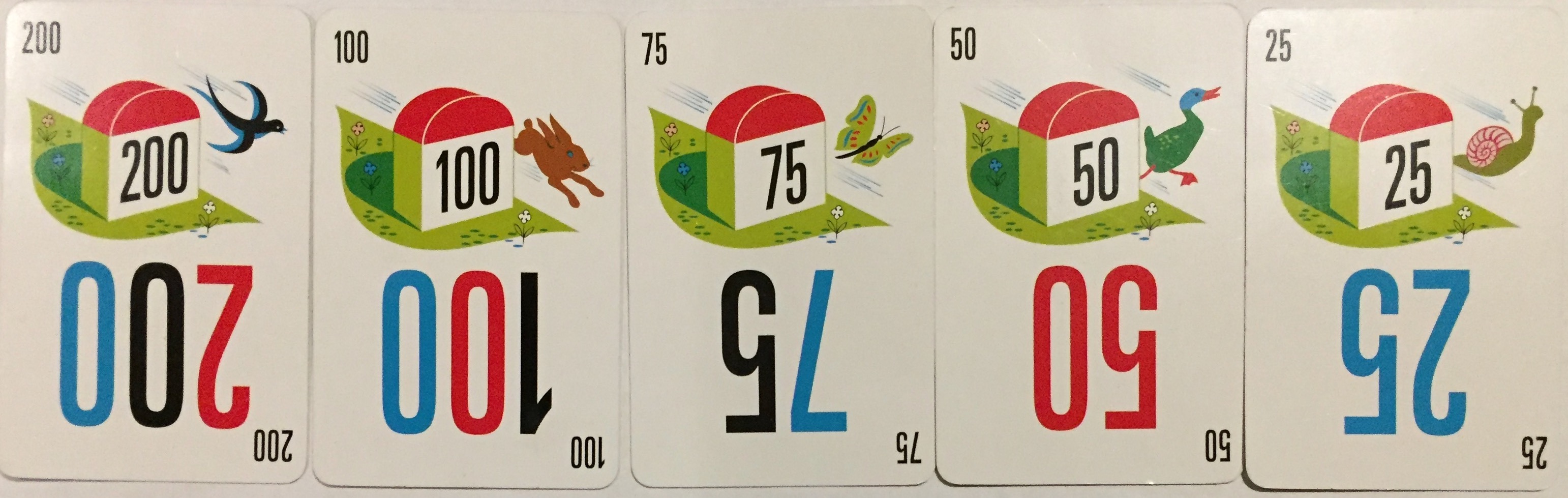
The game play was familiar, but this time I can also appreciate the exquisite card design. First, a quick summary of the rules to provide some context. There are five denominations of milage cards, and the game ends when one player has amassed 1,000 miles.1
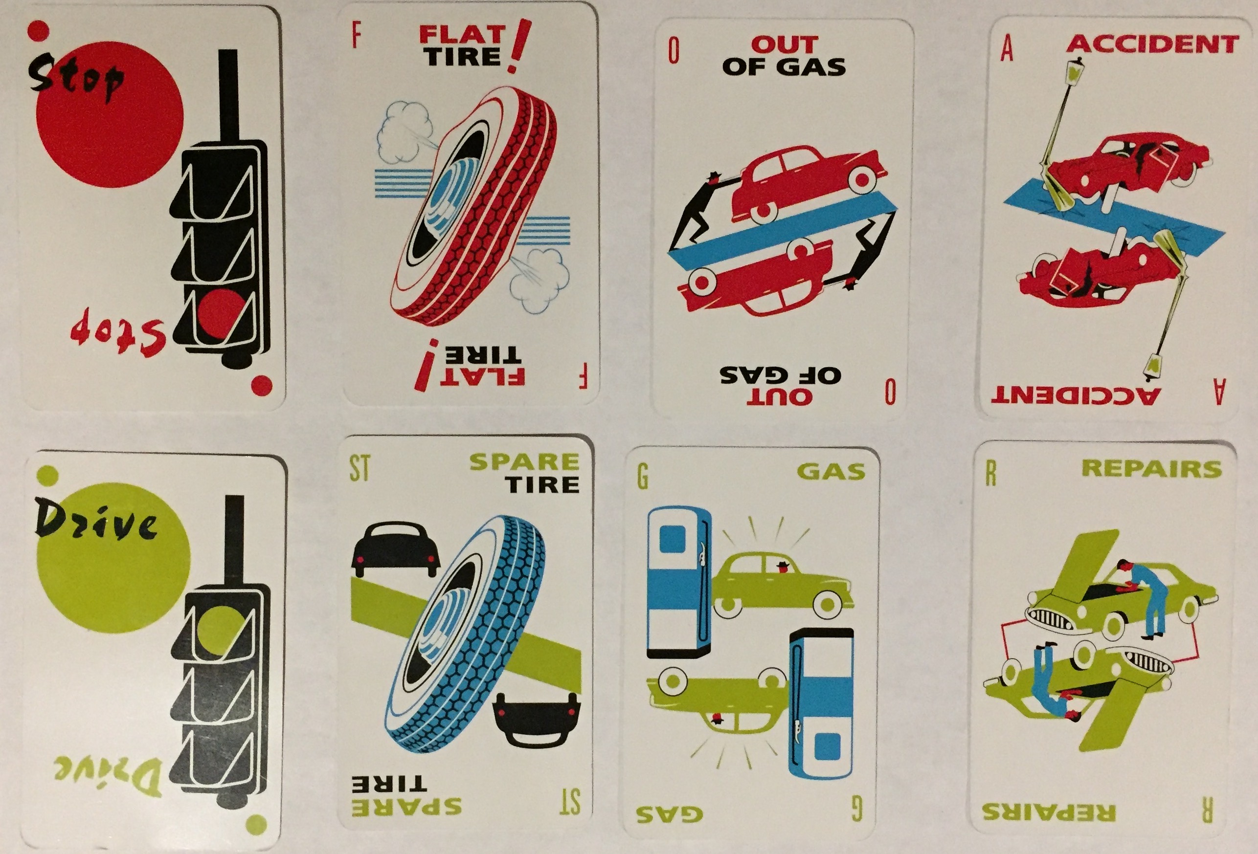
Once an opponent plays a drive2 to get started, you can sabotage them with any of four types of hazards, each of which has a correspond remedy:
This is already enough to illustrate some good design choices:
- Red is bad; green is good. Consistently.
- The main images are distinctive and easily recognizable when played across the table.
- There is no right-side up.
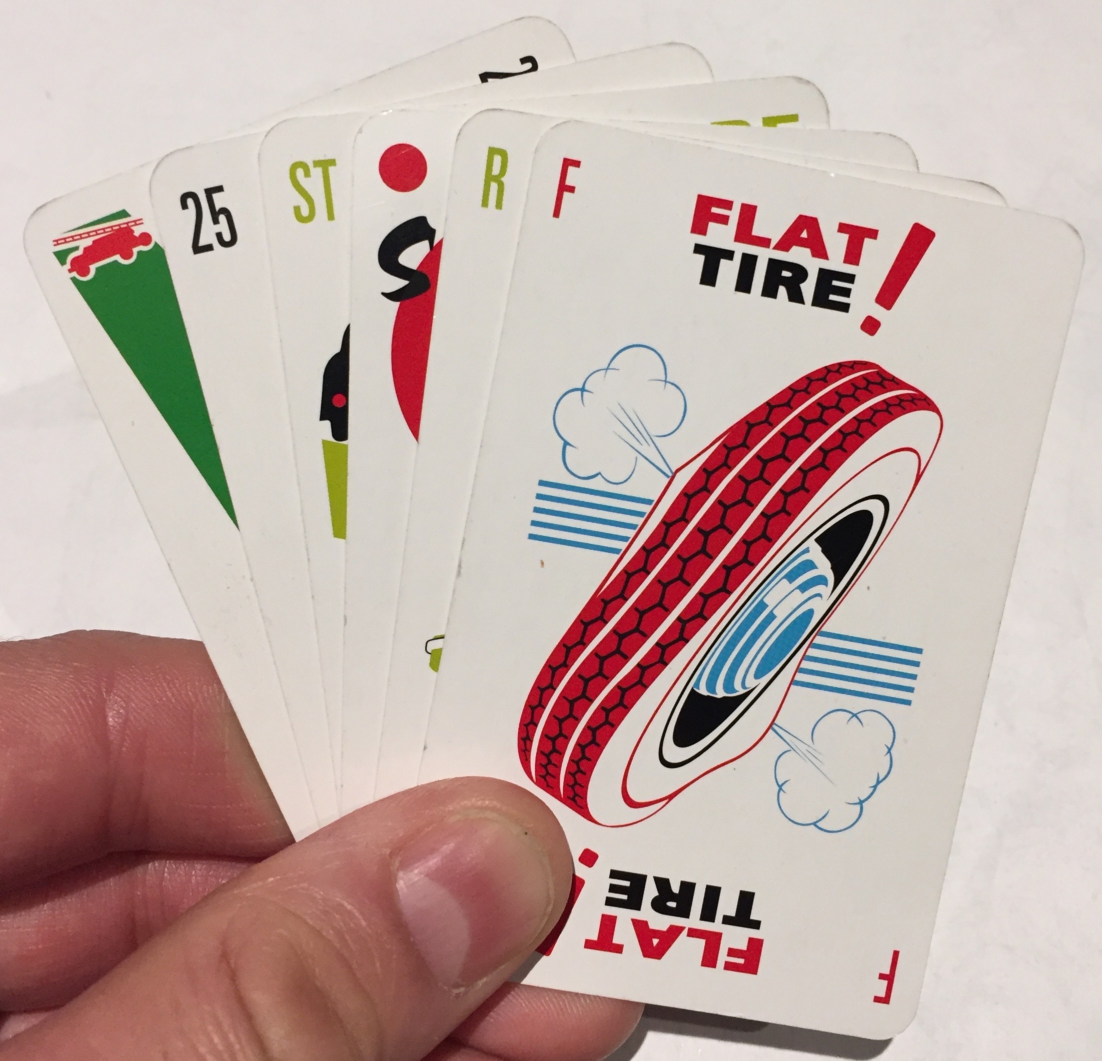
Even better, everything is summarized by unique and color-coded iconography when the cards are fanned. Stop and drive use stop-light evoking circles, while the hazards and remedies use unique first letters.
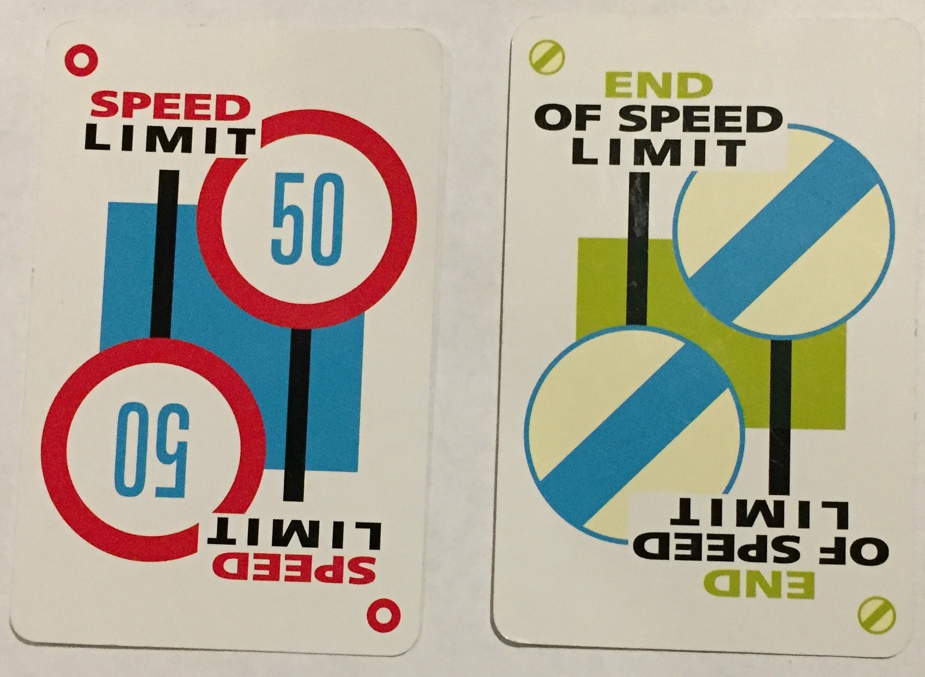
These are all basic design elements found on common playing cards, but it’s shocking how many games with custom card suck. (A future post will feature a terrible card game.) Good design has internal consistency, and Mille Bornes’ extends to the rest of the deck. The speed limit and its remedy use color consistently and subtly repurpose the circle motif:
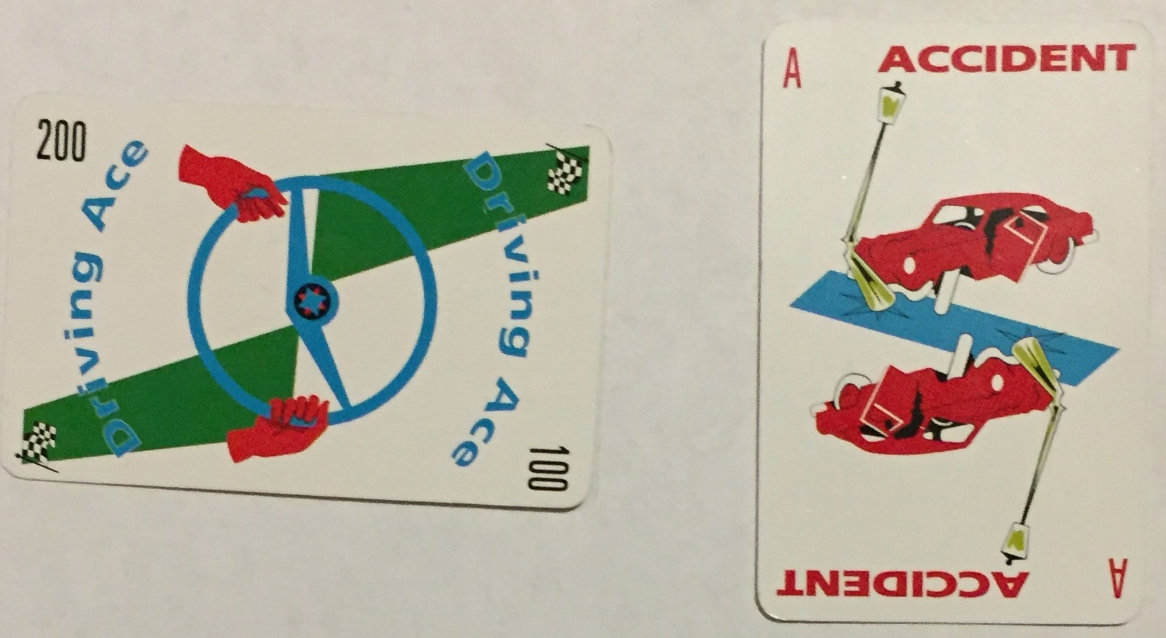
But the best designs are saved for the four most powerful cards in the game, the safeties:
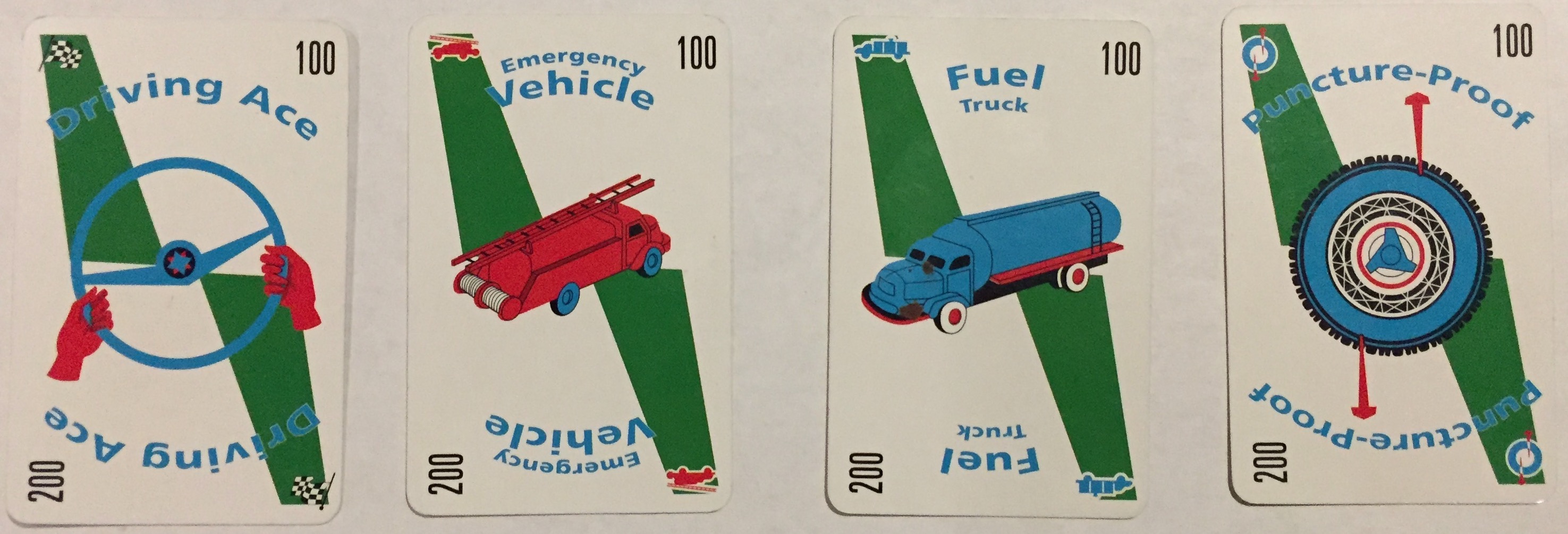
Safeties are permanent remedies for each of the hazards (fire truck is my fav because it counters both stop and speed limit). The card names are well-chosen: it’s pretty obvious which one pairs up with each hazard. The corners pop because they use icons instead of letters, and the solid green strips draw further attention whether they’re across the table or fanned out in your hand.
But the numbers printed in the corners are my favorite detail. When a safety is played like any normal card it’s played vertically and worth 100 bonus points. But when played as a coup fourré3 (i.e. immediately after) a hazard, the card is played sideways. Want to guess how much it’s worth in that case? #typographyFTW
As an adult I appreciate the delightful design of Mille Bornes, but the best part is watching my kids fall in love with it for the same reasons I did: it’s easy to learn, possible to win (even against adults), and fun to play — thanks in part to good design.
-
In French, mille bornes. ↩
-
The font is reminiscent of the poster for the (fantastic) movie of the same name. I wonder if the game inspired the choice? ↩
-
an underhand trick ↩
#/media/File:Drive2011Poster.jpg)