In the spirit of railing against bad plots, I have a less celestial and more trivial example.1 If you open Activity Monitor on a Mac to the CPU tab there is a little CPU LOAD graph at the bottom that looks like this.
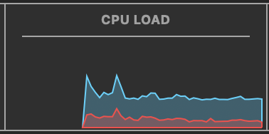
I like the visual design of a solid line with a lighter fill. It is easier on the eyes than a fully saturated fill and draws attention to the top of the graph, which is the quantity we’re trying to visualize. But the lighter fill conveys additional meaning: that the area below the solid bar is the CPU capacity that’s being utilized. Good Apple.
What I don’t like is that the solid line starts at zero on the left, jumps up to the first value, plots real data, and then jumps down again to zero on the right. This implies that the CPU load was zero at the start of the time series and is currently zero, but obviously this isn’t the case. This is a graphing mistake that implies data points that aren’t real. Bad Apple. It should look like this (I also eliminated a solid red bar that is inexplicably along the baseline.
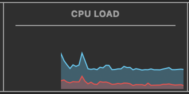
-
I know. Hold my beer. ↩