I’m not sure what I came across first: one of CGP Grey’s many flag videos or Roman Mars’s Ted Talk on the design of city flags (also available in written form).
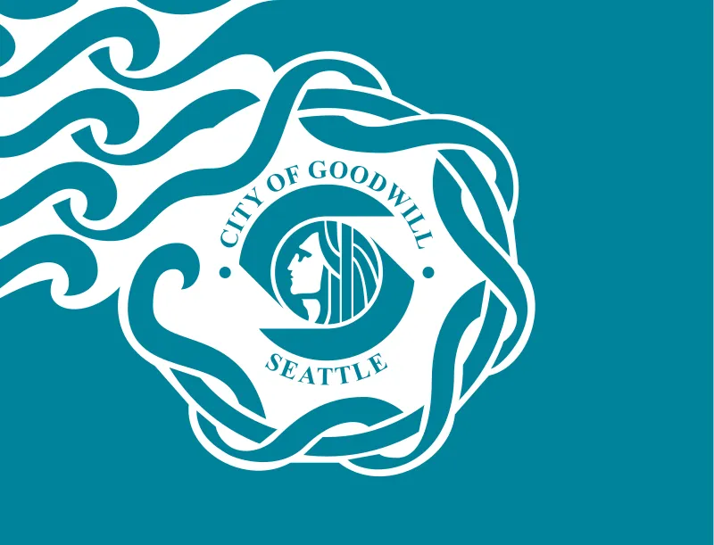
Regardless, once you learn to see a thing (in this case a poorly designed flag) you can see it everywhere. So imagine my horror when I looked up Seattle’s flag.

Heinous isn’t strong enough. Graded against the North American Vexillological Association’s flag design rules I give it an F-.
- Keep it simple. The flag should be so simple that a child can draw it from memory. Good luck getting those swirls or the knot correct, or remembering the details of Chief Sealth’s face.
- Use meaningful symbolism. The flag’s images, colors or patterns should relate to what it symbolizes. I’ll award points for effort, but there’s poor execution. Seattle is derived from Sealth, Native American imagery and names are woven throughout our local culture, and water is a meaningful symbol of Seattle. But the face is too small and detailed, and there are design elements (e.g., the interpuncts and the weave) with no obvious symbolism.
- Use two or three basic colors. Limit the number of colors on the flag to three that contrast well and come from the standard color set. There are only two colors, but the blue is weak, sickly, non-standard, and not evocative of the color of Pacific Northwest water.
- No lettering or seals. Never use writing of any kind or an organization’s seals. Using “CITY OF GOODWILL” and “SEATTLE” cap this flag’s best possible grade at a D. This is the easiest rule to comply with and can be objectively judged. Even if lettering was okay, which again, it’s not, the small serifed font looks bad and is hard to read.
- Be distinctive or be related. Avoid duplicating other flags, but use similarities to show connections. It’s definitely not a duplicate, but neither does it borrow or use any good flag design motifs — except for starting with a rectangle.
I’m not alone in my criticism. The Seattle Times and The Stranger have both run flag redesign competitions. Sadly, too many of these designs tried to salvage the untenable Chief Sealth visage. The Emerald Isthmus was a finalist in both contests and my favorite, although it’s on the border of being too busy.
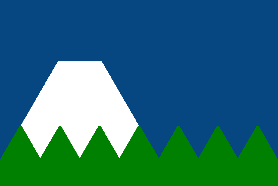
So with that, here’s my attempt.

The blue field represents the waters of Lake Washington and Puget Sound, which bound the city to its east and west. The white, truncated triangle represents glacier-covered, flat-topped Mount Rainier, which is not actually that close to the city but still features prominently in iconic city photographs and is intentionally framed up | by architecture.1 Seattle is one of many cities to claim it was built on seven hills, represented by the seven smaller peaks — in green because so much of the city is forested with evergreen trees.
In terms of construction, I divided the field into three horizontal bands. The green3 hill peaks just touch the top of the bottom band and are formed by seven equilateral triangles that completely span the flag’s width. The rest of the bottom band, below the triangles, is filled with the same green. Mt. Rainier dominates the middle band and is formed by another equilateral triangle lined up to rise behind the first four hills. The top band is all blue2 and truncates the top of the Mt. Rainier triangle. I don’t know much about color theory, so I just picked a blue that seemed rich and a green with a bit of pop.
I’m a biased grader, but here’s my self-evaluation:
- This definitely passes the test of being simple enough for a child to draw, and I like that the design can be completely and unambiguously specified in words.
- For symbolism, I focused on the city’s geography and natural beauty: its hills and proximity to both water and mountains.
- The three colors look good together, clearly represent the city (the Mariners, Seahawks, and Sounders all use green and blue in their logos and uniforms), and correspond in a sensible way to the geometric design elements.
- No lettering or seals, obviously.
- The design is distinctive but borrows common flag-design elements like a field divided into three equal-height bars and the use of triangles.
I’m sure there’s room for improvement, but I’m comfortable saying this is a big step beyond the travesty we have now and think it looks pretty good when waving as well. Next, perhaps I’ll take on doing something about the state’s flag. 😫